The cover comes alive
The mission behind this broadcast package was to translate The New Yorker, a 90-year institution of American journalism, illustration, and cultural commentary, into a moving-image identity for the magazine’s first-ever docu-series pilot, produced by Alex Gibney’s Jigsaw Productions and Condé Nast Entertainment for Amazon’s pilot season.
The central challenge was unusual: the pilot wouldn’t simply launch. It would be voted on. As part of Amazon’s then-signature pilot season, viewers would decide whether the show became a full series. The identity therefore had to do two jobs at once: honor a 90-year editorial legacy built on stillness, restraint, and the printed page, and in 30 minutes convince an audience that this magazine belonged on screen.
The New Yorker Presents — Pilot
The cover comes alive The mission behind this broadcast package was to translate The New Yorker, a 90-year institution of American journalism, illustration, and cultural commentary, into a moving-image identity for the magazine’s first-ever docu-series pilot, produced by Alex Gibney’s Jigsaw Productions and Condé Nast Entertainment for Amazon’s pilot season. The central challenge was unusual: the pilot wouldn’t simply launch. It would be voted on. As part of Amazon’s then-signature pilot season, viewers would decide whether the show became a full series. The identity therefore had to do two jobs at once: honor a 90-year editorial legacy built on stillness, restraint, and the printed page, and in 30 minutes convince an audience that this magazine belonged on screen.
The idea: the cover, already an art object in its own right, becomes the show. Iconic covers breathe, drift, and rearrange themselves frame by frame. The brand mark doesn't sit on top of the artwork; it emerges from inside it.
We let the illustration remain the illustration. Motion served the brushwork, never overrode it. Less an animated logo, more a curated gallery in time.
The idea: the cover, already an art object in its own right, becomes the show. Iconic covers breathe, drift, and rearrange themselves frame by frame. The brand mark doesn't sit on top of the artwork; it emerges from inside it.
We let the illustration remain the illustration. Motion served the brushwork, never overrode it. Less an animated logo, more a curated gallery in time.



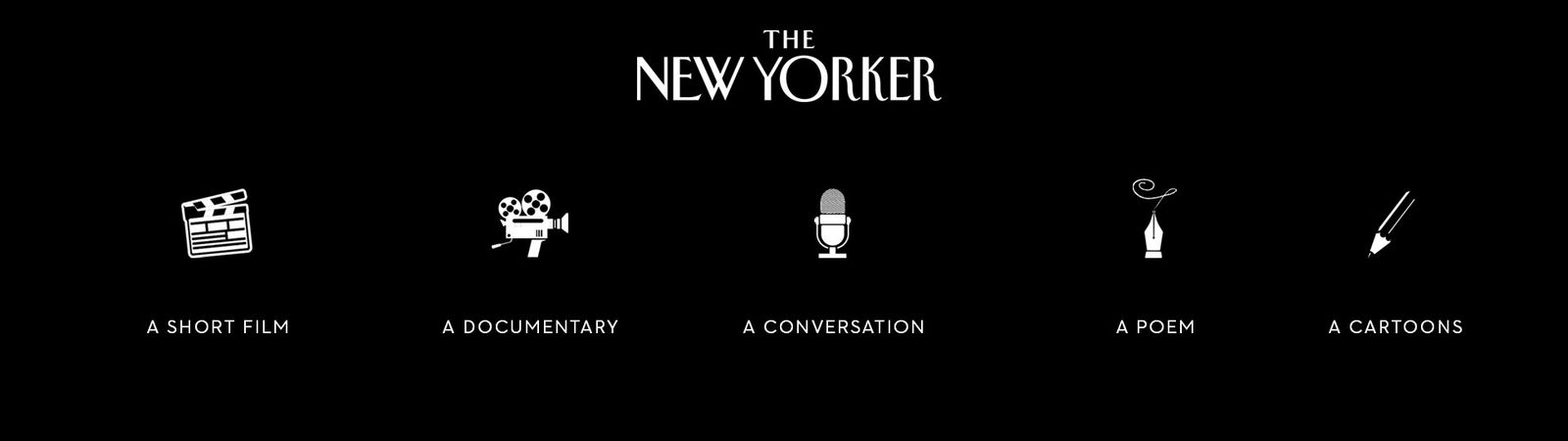
Seven cover treatments, three composition systems, an icon library for the chapter structure — each a different theory of how The New Yorker could move. The exercise wasn't about volume; it was about pressure-testing every assumption.
Seven cover treatments, three composition systems, an icon library for the chapter structure — each a different theory of how The New Yorker could move. The exercise wasn't about volume; it was about pressure-testing every assumption.


Bumpers, end pages, lower-thirds, credit cards — all rooted in the magazine's typographic DNA: Irvin display, generous margins, hand-rendered ornaments. Each transition reads as a page turn rather than a hard cut. Amazon greenlit the pilot the following month, and The New Yorker arrived on screen looking, sounding, and reading exactly like itself.
Bumpers, end pages, lower-thirds, credit cards — all rooted in the magazine's typographic DNA: Irvin display, generous margins, hand-rendered ornaments. Each transition reads as a page turn rather than a hard cut. Amazon greenlit the pilot the following month, and The New Yorker arrived on screen looking, sounding, and reading exactly like itself.